


Our current project proposal is posted as an Adobe PDF file on our Google Docs. While much of the Methodology section is still a work in progress we have a strong basis for what we plan to do while in Venice.
In the past couple of weeks I’ve been sharpening my Photoshop skills and trying to learn Illustrator and Flash as fast as possible. Layers Magazine (the official Adobe magazine) has a ton of useful information, tutorials, and professional insight. I’d recommend checking it out as a primer on any Adobe product.
Flare is a toolkit designed to fit into Adobe Flash’s programming language – ActionScript. It is meant for the creation of graphics and visuals – making working with data in Flash much easier.

Pictured above is just one layout options for displaying data trees. This Flash library should help facilitate our groups goal of creating really engaging graphics.
Smashing Magazine is a great resource for design professionals across all mediums. A post made on 1/14/08 details a serious amount of infographics resources and styles for inspiration.
The Monday Inspiration Editorial regularly gives designers that extra boost of creativity even if they have an extreme case of the Mondays.

I came across a blog post yesterday detailing some components that can be ported into Adobe Flash to create some really interactive visuals.
The Six Revisions blog post lists 10 easy to implement out of the box solutions for developing graphs, charts, and the like. This source will be useful in identifying how we will begin to construct our “killer graphics”.

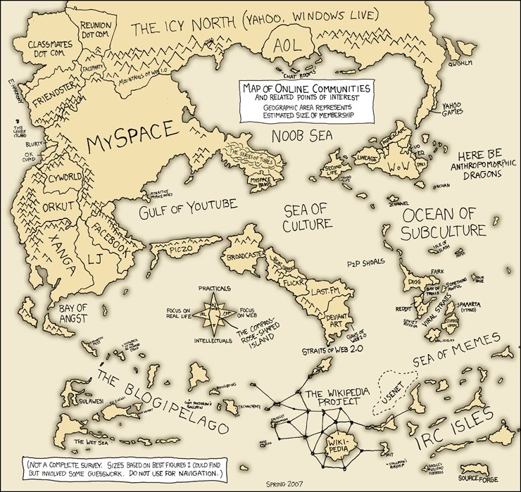
One of the most important parts of our research is not only to find out what programs to use to create our graphics but also examples of what is out there for killer graphics. Without examples we would have to rely solely on creativity to create the graphics for our project. The New York Times is one of the best places on the web to find killer graphics. The New York Times has graphics such that shows the deaths among American and other coalition troops, as well as the the date and location of the attack. It is a really interesting graphic that allows the viewer to understand the information through pictures. Knowing how to create the graphics is simply not enough. You also have to have the creativity to convey your data in an eye catching and understandable way.
SpatialKey is an impressive web-based solution to location-based data. The app, still in beta phase, is currently free to sign up for and offers a wealth of features to analyze information on a map. Specializing in the visualization of temporal and geospatial data, SpatialKey could certainly be the means for our infographic needs.
Check out this video introducing the app:

The software supports importing data using the popular .csv (comma separated values) format, which can be exported from most spreadsheet programs (read: excel). Once imported, SpatialKey intelligently searches through the file and begins to summarize and filter it – prompting you with some options for visualization. Fields with titles like longitude, latitude, address, or even IP address will all be read into the software and overlaid on a map.
Detailed reports and analysis tools are available once you get your data uploaded and filtered. Overall, the sheer amount of things you can do with the information is definitely overwhelming. I signed up for an account and started to mess around some sample datasets – hopefully I’ll add some pictures of what comes out!


